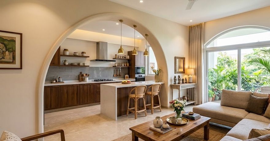




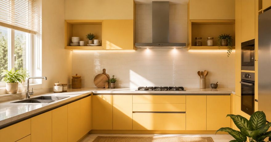
Choosing the right kitchen colour as per Vastu is believed to promote positivity, balance, and a harmonious cooking environment. According to Vastu Shastra, colours influence the energy of a space and should complement the kitchen's direction and the fire element associated with cooking. While shades like yellow, green, orange, and cream are often recommended, the ideal choice also depends on your kitchen's layout and natural lighting.
In this guide, we'll explore the best kitchen colours according to Vastu, colours to avoid, and practical design tips to create a functional and visually appealing kitchen. By combining traditional Vastu preferences with practical interior design, homeowners can create a kitchen that feels both harmonious and modern.
Why Kitchen Colours Matter in Vastu Shastra
According to traditional Vastu Shastra, different colours are associated with different elements, directions, and qualities. Since the kitchen is connected with the fire element, warm and balanced shades are often preferred for this space. Choosing kitchen colour as per Vastu is therefore traditionally considered a way to create a balanced environment around the cooking area.
However, colour selection should not be based on direction alone. Natural lighting, kitchen size, cabinet finishes, flooring, countertops, and personal preferences also influence how a colour works in the space. Colour Selection Matters because it creates a visually pleasant cooking environment, can make small kitchens appear more spacious, helps coordinate cabinets, walls, and countertops, complements natural and artificial lighting and allows homeowners to create a consistent interior theme.
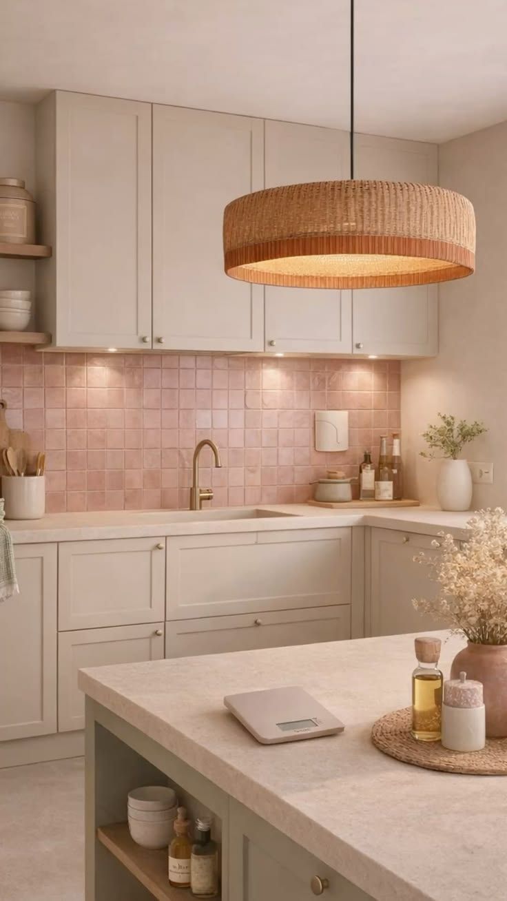
Best Kitchen Colours as per Vastu
Several shades are traditionally considered suitable for kitchens. Warm, earthy, and lighter tones are commonly preferred because they can create an inviting and balanced atmosphere. Some of the commonly recommended Vastu colours for kitchen spaces are given below.
| Colour | Traditional Association | Interior Benefit |
|---|---|---|
| Yellow | Warmth and positivity | Brightens the kitchen |
| Orange | Fire and energy | Adds warmth and vibrancy |
| Light Green | Freshness and balance | Creates a natural feel |
| Cream | Calm and neutrality | Makes spaces feel spacious |
| Beige | Earthy and stable | Works well with wood finishes |
| Light Brown | Natural and grounded | Complements modern kitchens |
| Peach | Warm and welcoming | Adds a soft decorative touch |
If you are looking for the best kitchen colour, consider the direction of the kitchen together with its lighting, size, and existing finishes rather than selecting a colour based on Vastu alone.
Kitchen Colours Based on Direction
Traditional Vastu recommendations often associate specific directions with particular elements. Because the kitchen is connected with fire, the southeast is traditionally considered an important location for kitchen planning. The table below provides commonly followed colour recommendations.
| Kitchen Direction | Commonly Recommended Colours | Suitable Design Approach |
|---|---|---|
| Southeast | Orange red peach pink | Warm accents with neutral backgrounds |
| South | Orange red earthy tones | Warm shades balanced with cream or beige |
| East | Green light brown | Fresh natural colour combinations |
| North | Green light blue cream | Light and refreshing palette |
| West | White grey beige | Neutral and contemporary combinations |
| Northeast | Light yellow cream light green | Soft bright and minimal palette |
| Southwest | Beige brown earthy shades | Warm and grounded combinations |
| Northwest | White cream light grey | Light neutral palette |
When applying kitchen Vastu tips, avoid creating a colour scheme that makes the room excessively dark or visually overwhelming simply to follow a directional recommendation.
Colours to Avoid in the Kitchen
Traditional Vastu practices often recommend limiting certain dark or overly intense colours in kitchen spaces. Commonly avoided or limited shades include excessive black, dark blue, dark grey, muddy or overly dull shades and excessively dark combinations.
Dark shades can absorb more light and may make a small kitchen feel enclosed. That does not mean dark colours must be completely avoided. They can be introduced strategically through cabinet handles, countertops, backsplashes, appliances, or small accent areas. For example, a cream kitchen with a charcoal countertop can create a sophisticated appearance without allowing a dark colour to dominate the entire space.
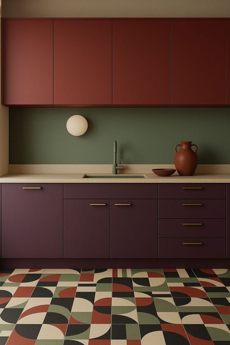
Choosing Colours for Walls, Cabinets, and Countertops
Your kitchen wall colour should complement the cabinets, flooring, backsplash, countertop, and available natural light.
Walls
For smaller kitchens, light shades such as cream, beige, soft yellow, or pale green can help create a brighter appearance.
Cabinets
Cabinet colours have a major influence on the overall look because they typically occupy a large visual area. Popular modular kitchen colours include white and cream, beige and taupe, light green, natural wood, soft grey and two-tone combinations.
Countertops
Choose countertops that complement rather than compete with your cabinets and walls. Go for colour choices such as white, cream, natural wood, light green and grey.
When selecting kitchen interior colours, consider how the entire palette will look under both daytime sunlight and artificial lighting.
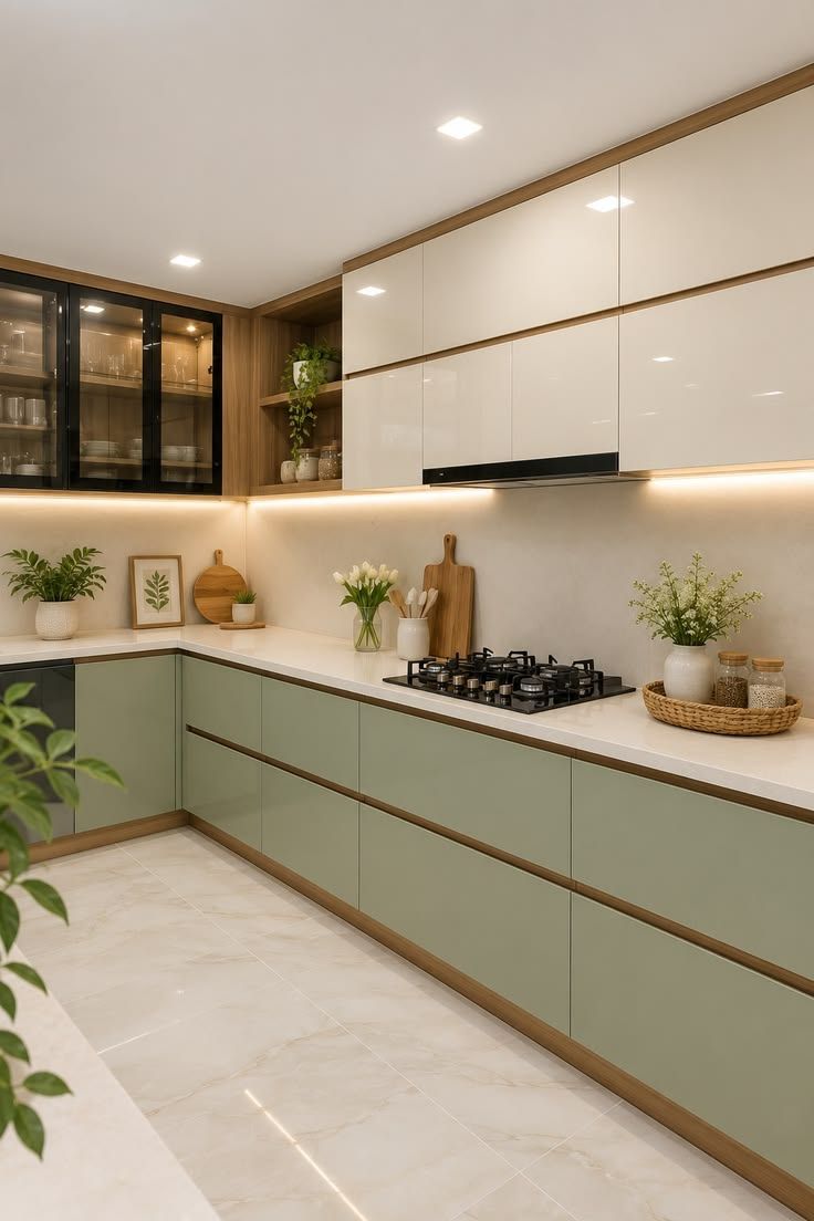
Vastu Tips for Modular Kitchen Design
When planning Vastu for kitchen, colour selection can be combined with a well-organized layout rather than treated as a standalone decision. Some of the practical recommendations are given below.
- Prefer Balanced Colour Palettes: Use warm or light shades as the primary palette and introduce stronger colours through small accents.
- Coordinate Cabinets and Walls: Avoid using too many contrasting colours. A consistent palette creates a cleaner appearance.
- Use Natural Light: Make the most of windows and openings so colours appear brighter during the day.
- Choose Practical Finishes: Select surfaces that are easy to clean, particularly around the cooking and preparation areas.
- Add Accent Colours Carefully: Use brighter shades through backsplashes, handles, open shelves, or accessories rather than overwhelming the entire kitchen.
- Maintain Visual Balance: Pair darker countertops or cabinets with lighter walls to prevent the kitchen from appearing too enclosed.
For homeowners following kitchen design Vastu, the aim is to combine traditional colour preferences with a layout that remains functional for everyday cooking.
Common Kitchen Colour Mistakes to Avoid
Avoid these below common mistakes when choosing colours for your kitchen.
- Using Too Many Colours: Combining several bright shades can make the kitchen look visually busy. Stick to a primary colour, a supporting neutral, and one accent shade.
- Ignoring Natural Lighting: A colour that looks attractive in a showroom may appear completely different in your kitchen. Test samples under the room's actual lighting conditions.
- Choosing Very Dark Colours for Small Kitchens: Dark shades can make compact kitchens feel smaller. Use them selectively with lighter walls or cabinets.
- Matching Everything Exactly: Using the same colour for walls, cabinets, countertops, and accessories can make the space look flat. Introduce subtle contrast for visual depth.
- Following Vastu at the Expense of Functionality: Traditional colour recommendations should not prevent you from choosing practical, easy-to-maintain finishes that suit your family's needs.
- Ignoring the Countertop and Flooring: Cabinet and wall colours should work with existing floors and countertops rather than being selected independently.
- Skipping Colour Samples: Always test a few shades before committing to a large area. Natural and artificial light can significantly change how colours appear.
Balancing Vastu with Modern Interior Design
The Kitchen colour ideas below allow homeowners to create attractive interiors while incorporating traditional preferences in a subtle and practical way.
- Use Neutral Base Colours: Cream, beige, soft white, and light earthy shades work with almost any modern design style.
- Add Traditional Accent Shades: Orange, yellow, or green can be introduced through smaller design elements.
- Consider Kitchen Lighting: Under-cabinet LEDs and ceiling lights can enhance the appearance of both light and dark surfaces.
- Coordinate Materials: Wood-look cabinets, natural stone countertops, and neutral walls can create a warm appearance while maintaining a contemporary aesthetic.
- Prioritize Function: Colour should never interfere with visibility, cleaning, ventilation, or safe movement around the cooking area.
Frequently Followed Kitchen Vastu Recommendations
The table below summarizes some commonly followed approaches.
| Vastu Recommendation | Modern Design Interpretation |
|---|---|
| Prefer warm colours for kitchens | Use orange peach or yellow as accents rather than covering every surface |
| Light shades are commonly preferred | Use cream beige or soft white to create a brighter kitchen |
| Consider the kitchen direction | Coordinate the colour palette with the home's layout while maintaining practical lighting and ventilation |
| Avoid excessive dark colours | Use black charcoal or dark blue selectively for contrast |
| Keep the kitchen visually balanced | Combine one dominant shade with neutral and accent colours |
| Consider the fire element | Warm shades can be introduced through backsplashes accessories or cabinet details |
Final Thoughts
Choosing a kitchen colour is both a design decision and, for homeowners who follow Vastu Shastra, a traditional consideration. However, there is no need to sacrifice functionality or personal style. Ultimately, kitchen colour Vastu can be incorporated through thoughtful colour selection rather than rigid rules.