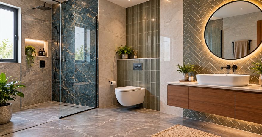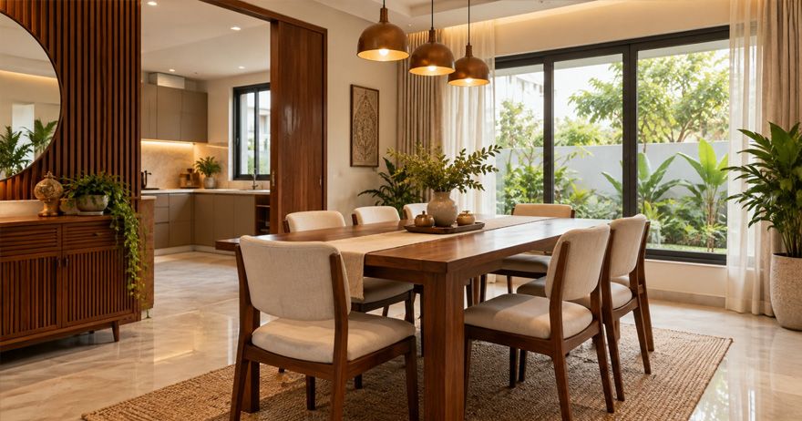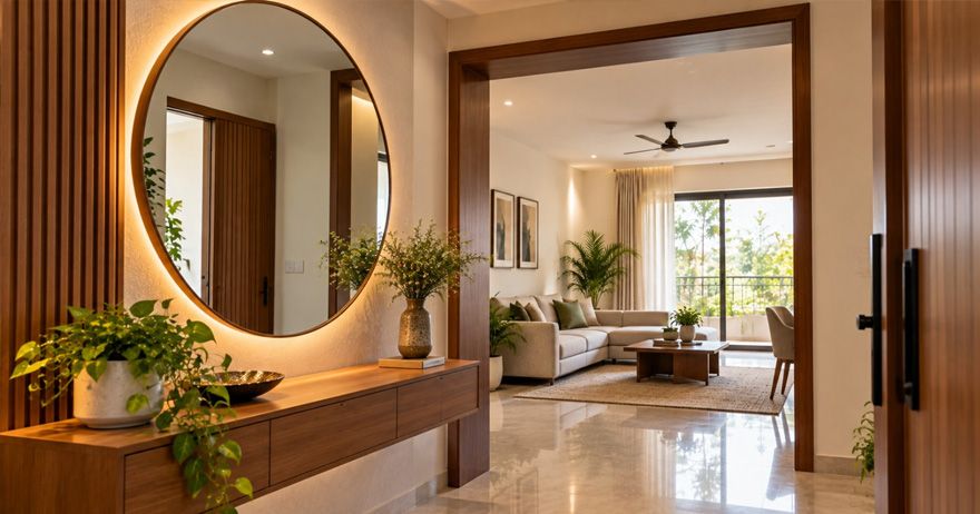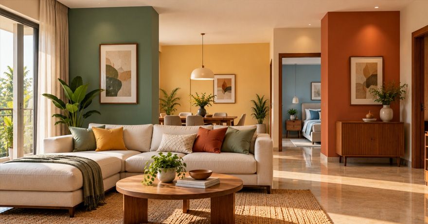
Colours can influence how a room looks and how people perceive and experience the space. They can make interiors feel warmer, cooler, brighter, calmer, more energetic, or more spacious depending on the shade, intensity, lighting, and surrounding materials. Understanding colour psychology in home interiors can therefore help homeowners make more thoughtful choices when selecting wall paints, furniture, fabrics, and decorative accents.
What Is Colour Psychology in Interior Design?
Colour psychology is not a strict formula where one colour always produces one emotional response. The exact effect can change according to saturation, brightness, combinations, room size, lighting conditions, and cultural associations.
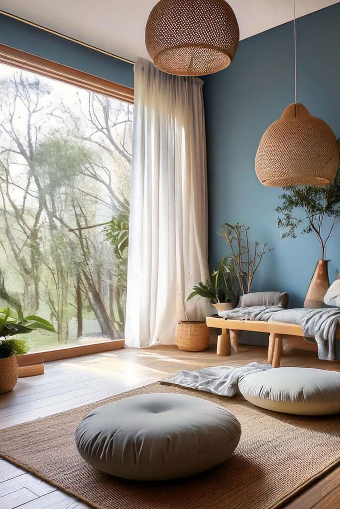
How Colours Can Influence the Feel of a Room
Colour is one of the easiest ways to alter the visual character of an interior without changing its structure. When exploring colour psychology for home, consider these four characteristics:
- Hue: The basic colour family, such as blue, green, yellow, or red.
- Value: How light or dark the colour is.
- Saturation: How intense or muted the colour appears.
- Temperature: Whether the colour feels visually warm or cool.
White: Bright, Clean, and Spacious
When considering the best colours for home interiors, white is particularly useful when you want flexibility and a brighter visual base. White remains one of the most versatile choices for Indian interiors.
White also provides a flexible background for colourful furniture, artwork, wooden finishes, plants, and textiles. White works well in small living rooms, compact bedrooms, kitchens, hallways, ceilings and minimalist interiors.
Blue: Calm, Cool, and Relaxing
Blue is commonly associated with calmness and coolness, making it a popular option for spaces intended for relaxation. Light blue can create an airy atmosphere, while medium and deeper blues can produce a richer appearance.
Blue can work particularly well when balanced with warm wood, cream, beige, or natural textures. For room colour psychology, the important consideration is selecting the appropriate intensity for the room's size and lighting.
Green: Natural, Fresh, and Balanced
Green is strongly associated with nature, foliage, and freshness. It can introduce a natural quality into interiors, particularly when combined with wood, plants, rattan, stone, or other earthy materials.
Green can work well in living rooms, bedrooms, home offices, reading corners and dining spaces. Green is also versatile because it can sit between warm and cool visual palettes.
Yellow: Warm, Cheerful, and Energetic
Yellow can introduce warmth and brightness into a room. Softer yellows can feel welcoming without becoming overwhelming, while highly saturated yellow can create a strong visual statement.
Yellow can work particularly well in areas where you want an energetic and social atmosphere. Natural daylight can also significantly change how yellow appears.
Red: Bold, Warm, and Attention-Grabbing
Red is a powerful colour that can immediately draw attention. It can make an interior feel warm, energetic, and dramatic. Red is effective as an accent rather than being used across every wall.
A deep burgundy, muted terracotta, or earthy red can provide a more sophisticated appearance than an extremely bright red. The amount of red used can dramatically affect the overall result.
Orange: Social, Vibrant, and Inviting
Orange combines the warmth associated with red and the brightness associated with yellow. It can create a lively and welcoming atmosphere. Muted terracotta, burnt orange, peach, and rust can be easier to integrate into Indian interiors.
Orange can work particularly well with beige, cream, white, brown, natural wood and green. For a balanced look, consider using orange as an accent against a neutral background.
Pink: Soft, Warm, and Playful
Pink is available in a wide range of shades, from barely-there blush to rich magenta. Its effect depends heavily on saturation and the colours surrounding it. Soft pinks can create a gentle and warm appearance, while stronger pinks can make an interior feel energetic and expressive.
Dusty rose, blush, muted mauve, and terracotta-pink shades can work beautifully in contemporary bedrooms and living spaces.
Purple: Rich, Creative, and Luxurious
Purple can bring depth and character to an interior. Depending on the shade, it can feel sophisticated, creative, dramatic, or calming. Soft lavender and lilac can create a lighter, more relaxed atmosphere.
Because deeper purple shades can be visually strong, they often work best when balanced with neutral colours such as white, cream, beige, or light grey.
Brown and Earthy Tones: Warm and Grounded
Brown and earthy shades can make interiors feel warm, natural, and grounded. They work particularly well with wooden furniture, stone, plants, woven materials, and other natural textures.
When developing home interior colour ideas, earthy tones can provide a dependable base that allows brighter colours to be introduced through furniture and accessories.
Grey and Black: Sophisticated and Contemporary
Light grey can create a clean and understated background, while charcoal can introduce greater depth. A combination of light grey walls, wooden furniture, and black accents can create a balanced modern palette.
Black is more visually dominant and is often best used selectively. Black frames, furniture, doors, lighting fixtures, or feature walls can create contrast without making the entire room feel dark.
How to Choose Colours for Different Rooms in an Indian Home
Understanding choosing colours for different rooms starts with considering the purpose of each space, its natural light, size, furniture, and the atmosphere you want to create. When selecting colour schemes for Indian homes, climate, natural light, architecture, furniture, and cultural preferences can all influence the final palette.
Living Room
Neutral walls paired with warm wood, green, blue, terracotta, or other accent colours can create a balanced environment. For colour ideas for living room, consider the amount of daylight first.
Bedroom
soft blues, muted greens, warm neutrals, dusty pinks, and understated earthy shades can work well. This is where bedroom colour psychology can be useful as a starting point.
Kitchen
White, cream, soft green, muted blue, warm beige, and carefully used yellow can all work depending on the cabinetry and countertop. Kitchen colour psychology should also account for practical factors.
Dining Room
Dining areas can accommodate warmer shades such as terracotta, muted orange, warm yellow, earthy brown, or deeper accent colours.
Home Office
Soft greens, muted blues, warm neutrals, and balanced grey tones can provide a calm background.
Common Home Colour Selection Mistakes to Avoid
- Choosing colours only from a small sample: A colour card may look different from an entire wall.
- Ignoring natural light: A colour that works beautifully in a bright room may appear considerably darker in a room with limited daylight.
- Using too many strong colours: Multiple intense colours can make a room feel visually busy.
- Matching everything exactly: Walls, furniture, curtains, rugs, and accessories do not need to be identical.
- Forgetting adjoining rooms: Open-plan homes require greater attention to colour transitions.
- Choosing colours without considering permanent finishes: Flooring, kitchen cabinets, countertops, wardrobes, and doors can remain for years.
Final Thoughts
Colour psychology in home interiors can be a useful framework for understanding how different shades may influence the visual character and perceived atmosphere of a room. The most successful interiors usually balance colour theory with practical considerations such as room size, natural light, artificial lighting, furniture, flooring, climate, and personal preference. Ultimately, the best colour is one that works with the space and makes you feel comfortable in it.