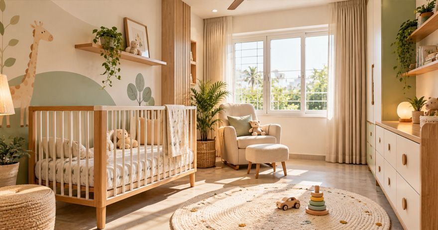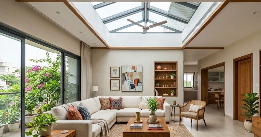




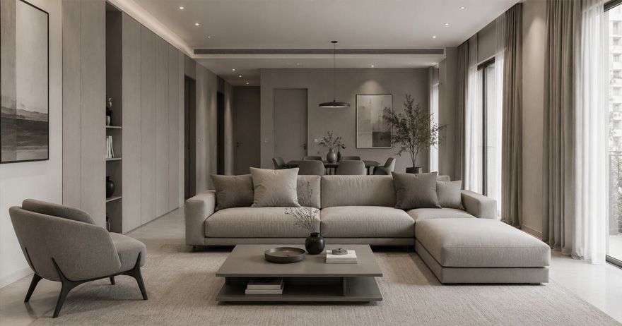
Monochrome home design is a style of decorating your home using different shades, tints and tones of one color instead of mixing different colors together. As you can imagine, black and white is one option but also using neutrals or beiges is also monochrome or a gray kitchen.
The only rule for a monochrome room is if you take away color, texture has to do the work of color. A gray room with five different textures is more interesting to the eye than a gray room with five different flat paints.
Check out these 20 ideas by room, along with the challenges specific to Indian homes.
What Is Monochrome Home Design?
A monochrome color scheme typically uses one color in a number of different shades, tints, tones, and saturations. A sofa in charcoal, a rug in mid grey, pale grey walls and white ceiling are all variations of the same shade.
In the more common usage, the neutral colors of black, white, and grey are also considered to be monochrome. This is likely the color scheme that most Indian homes lean towards.
A rough breakdown would be 60 percent neutral shade, 30 percent secondary hue, and 10 percent contrast color. So if using pale grey walls, a darker grey sofa and similar toned rug, then black picture frames and lamp bases would make up the 10 percent.
Why Monochrome Interiors Are Trending
It photographs well, which is probably how it got on social media and into new flats. It also works well in small spaces, as a single colour family creates the illusion of less internal boundaries: fewer walls, fewer furnishings, and so on.
The practical reason is versatility: Indian homes are full of shifting displays of festival paraphernalia, fresh flowers, rangoli, and guests. All of these clash spectacularly with colour, but fit seamlessly into a neutral setting.
Black and White Living Room Ideas
- Off-white walls with a charcoal sofa – the easiest option that will never go out of style.
- A black wall behind the TV, which actually makes the screen less noticeable.
- A striped or geometric black-and-white rug, which defines the seating area.
- Black window and door frames, which act as picture frames for the view outside.
- A gallery wall made of black frames with black-and-white photos and large white margins.
- And one warm furnishing in wood, cane, or brass – without it, the room would look like a salon.
Monochrome Bedroom Design Inspiration
- Mixed white bedding layers in different textures: cotton sheet, knit throw, and linen cushion.
- Charcoal wall behind the headboard to keep the rest of the room light as not to close it in.
- Black bedside lamps with white shades add contrasting color interest at eye level.
- Heavier grey curtains in a different fabric add color and help with light and noise insulation.
- A black-framed mirror on the opposite wall from the window reflects morning sun.
Bedrooms are the room where cool grey tones make the most mistakes. A room with little natural light looks grey and dreary by nightfall. Better to go with warm greys or greige.
Elegant Monochrome Kitchens and Dining Areas
- Matte white shutters with a black granite counter are the most functional option in an Indian kitchen.
- The use of handle-less shutters in the same tone creates the illusion of a single surface.
- White subway tiles with dark grout provide pattern without using a second color.
- Dark chrome fixtures and a black sink serve as contrasting elements, though there is a caveat further down
- Black pendant lights provide contrast in this kitchen with a breakfast bar.
One caveat in using black accents in Indian kitchens is that matte black fixtures and counters show water spots and fingerprints. Water spots on the sink will be glaringly obvious in such a setting and will need to be wiped clean after every use. This is especially true for areas with hard water. If you are in such a region, it is best to avoid matte finishes in black in favor of brushed steel, and reserve black for your shutters and pendant lights.
Using Textures and Materials to Add Depth
This lifts a monochrome interior that doesn't look put together from something that does.
- Mix in at least four types of texture in the room: a matte on the walls, a woven rug, a glass coffee table, a fabric sofa.
- Furniture made of cane or rattan, for pattern and softness in otherwise neutral tones.
- Texture in the form of a roughcast wall or fluted panelling, rather than an accent wall in a darker shade.
- Natural stone with veining that takes over the look of the room, the better to hide the joins.
- Brass or aged gold fittings, the only metal allowed in the scheme to prevent it all from feeling too severe.
Choosing the Right Lighting for Monochrome Interiors
Lighting plays a far more important role in a room that needs to be made appealing as there is no other parameter (colour) that makes a room inviting. Choosing the wrong lighting will make the room look gloomy and not serene.
- It is best to go with warm white 2700K – 3000K as cool white tones would clash with the grey hues making the room look like an office corridor.
- Layer your lighting by adding a ceiling lamp, a floor or a table lamp along with an accent light. Having only one source (ceiling lamp) creates a generic look for the room.
- Accent lighting by having a strip light on one of the walls to bring out the texture in the paint that otherwise gets lost in the overall look.
- Maximising day light is key here as you don’t have another parameter (colour) to make the room appealing. Thin frames tend to hold more glass area making them a good choice to allow maximum sunlight into the house. It might be worth considering if you are going to replace any windows anyway. IndiFrame’s uPVC windows are available in white and laminated options in dark hues to make the windows blend with the overall colour of the room and not be an eyesore.
Common Monochrome Design Mistakes to Avoid
- All flat surfaces and no texture. The number one mistake which makes a room look empty and not minimal but just bare.
- Cool greys in a dull room. They become dirty and grey by evening.
- Too much black in the room. Especially in smaller rooms, it tends to shrink the room, so black should be used in no more than 10% of the room.
- Matte black in areas with hard water. This is a bad idea as the limescale will become visible on all surfaces.
- Not considering the dust. Dark coloured wood floors, counter tops and tables will show every speck of Indian dust in no time.
- A lack of warm materials in the home. If there is not a single surface made of wood, cane, brass or leather, then your home looks too white. It looks like a hospital.
- Not working with what you have. Old furniture like the pooja unit, almirah and the front door need to be incorporated in your new scheme.
- Having everything matched to a tee. It is good to have subtle differences in similar shades.
Tips for Creating a Balanced Monochromatic Home
- Choose your base shade, and then build the rest of your scheme around it.
- Think of the 60/30/10 breakdown as a starting point for every room.
- Run one palette throughout your home, varying only the percentages of each colour.
- Test the paint swatches out on your own walls at three different times of day before committing.
- Let plants provide the greenery. A big statement piece can anchor the room in botany.
- Leave space for seasonal colour changes - flowers, festive decorations, or a bright throw.
Final Thoughts
Monochrome home design can be made to work in Indian homes, if you think about the importance of texture, avoid using cold tones and think about dust and hard water at the specification stage. Think of it this way: pick a room to test the theory, set the base note, layer in four or five different materials, add a warm accessory and a potted plant, and observe the outcome after a few weeks of normal use.